
A mind mapping and visual productivity tool by Corel, used for brainstorming, planning, and organizing ideas into structured diagrams. MindManager Web is its browser-based app, bringing the desktop product's core mapping experience online.
I redesigned the template discovery experience to shift the product to a use-case-first browsing model, organizing templates around what users were trying to do (brainstorm, plan, flowchart) and leading them to options intentionally designed to support their workflow.
The redesign launched globally in four languages, improved perceived usability to 4.23/5 in beta testing, and was later adopted by the desktop app, extending the use-case-first model across the product's platforms.
The four constraints below shaped the way in which the Web experience was reimagined.
The redesign covered the homepage and template browsing only; top navigation and advanced features were out of scope.
Template categories had to be defined early to give enough runway for content creation before launch.
Limited design and engineering resources shaped what could be built and in what order.
The experience had to flow seamlessly into the separate Template Preview & Creation effort.
The Web app launched with a fraction of the template library available on desktop, and the templates it did offer were blank and generic, giving users no signal for when or how to use them.
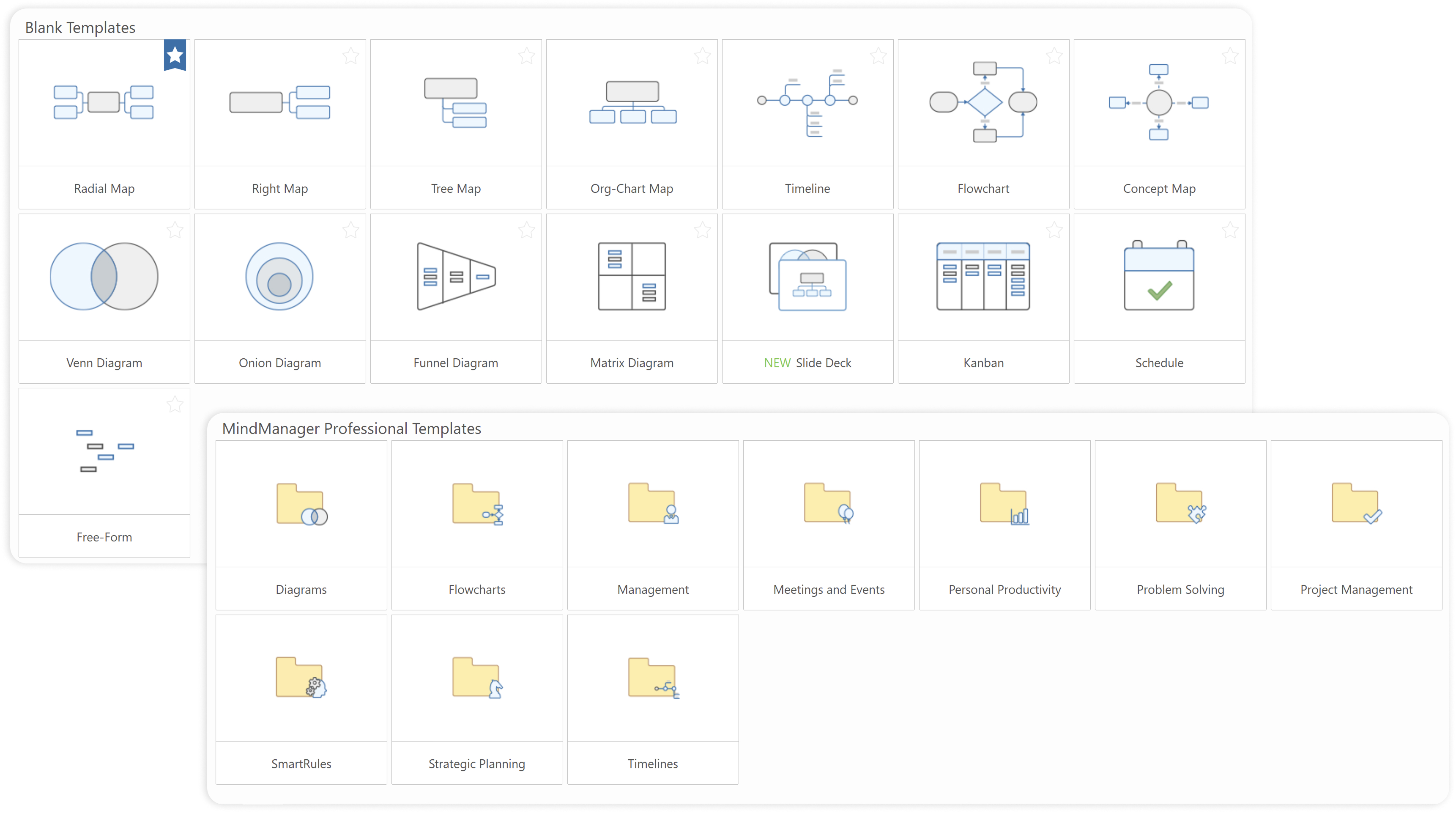
The home page itself gave users little to work with. Template options were limited and not tied to any use case, no tutorial content existed for users who wanted to learn how templates worked, and the most prominent action on the page was theme selection, a decision users had no reason to make before entering the canvas.
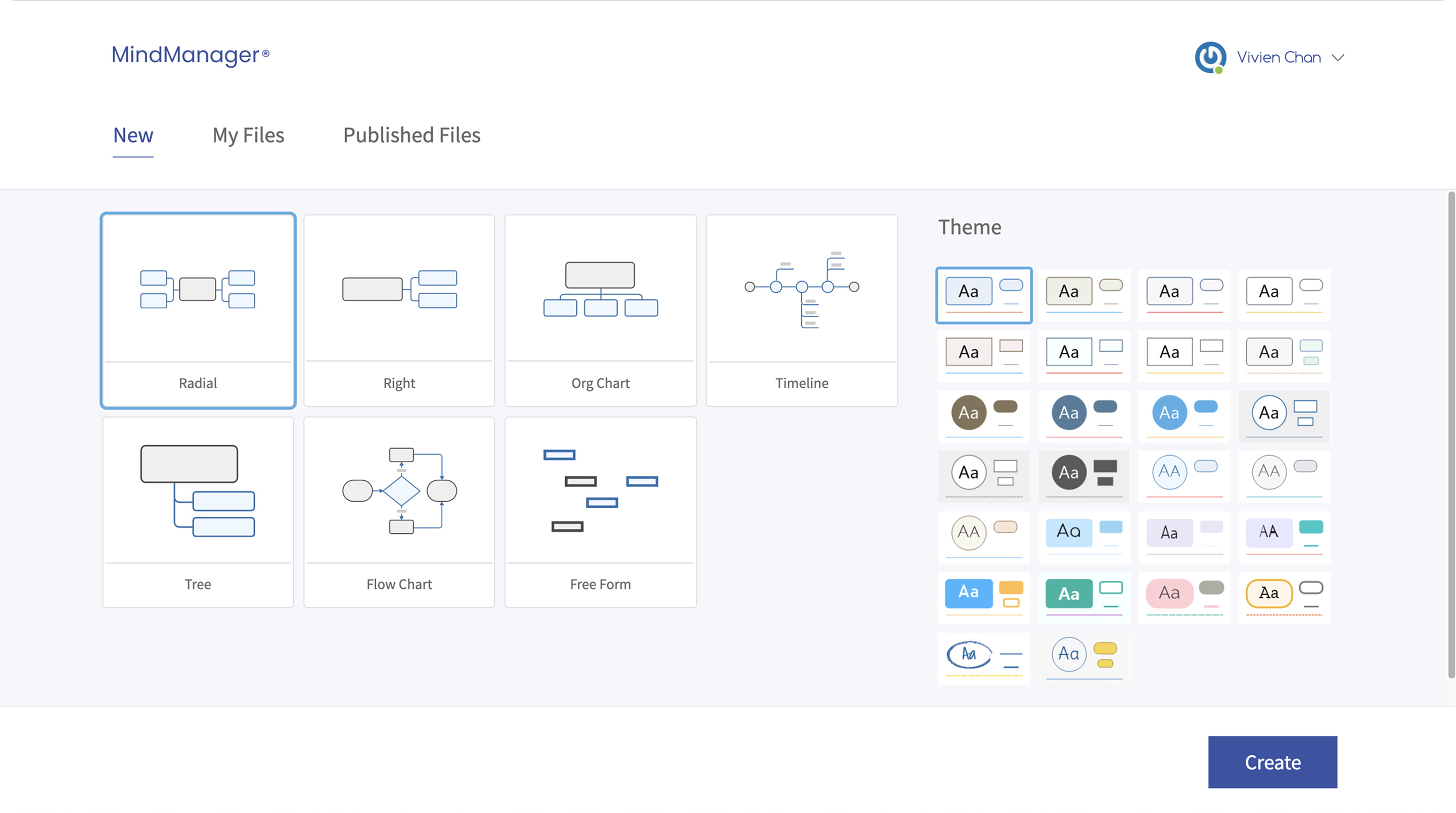
From a business perspective, the risk was losing new users before they ever got started. Compared to tools like FigJam, Miro, and Lucidchart, MindManager's blank slate experience was not keeping pace, and users who could not find a relevant starting point had little reason to stay.
Drawing on competitive analysis, customer survey insights, and early design exploration, I worked closely with Product on a use-case-first discovery model for MindManager Web. The strategy focused on:
Help users translate what they are trying to accomplish into a use-case category so finding the right template feels like the natural next step.
Structure template discovery around use cases to encourage exploration of how MindManager supports different types of projects.
Balance guided discovery with direct access to foundational templates, preserving established workflows while encouraging broader exploration.
Research and usability testing surfaced clear gaps between what users were trying to do and how the experience was guiding them. Each finding mapped directly to a design decision.
Users came to MindManager with rough ideas or goals in mind, not template names. They thought in terms of what they wanted to accomplish (brainstorm, plan, organize), not in terms of which blank canvas to start from. The home experience was restructured to meet them there, leading with use-case categories so users could point to a problem area and let the product guide them to relevant templates from there.
Usability testing repeatedly surfaced the same reaction: users had no idea MindManager could do as much as it could. When asked how they would approach a specific problem, users could not tell whether one blank template was a better fit than another. Organizing templates around use cases, along with new templates to fill each category, turned browsing into a way to discover what MindManager was actually capable of.
User interviews revealed a clear divide. Power users wanted to jump straight into a project and struggled to locate the blank templates they were used to, while new users found the categories helped them form workflows they would not have arrived at on their own. As a result, foundational blank templates were preserved alongside the use-case structure, letting experienced users start without friction while keeping categories available for discovery.
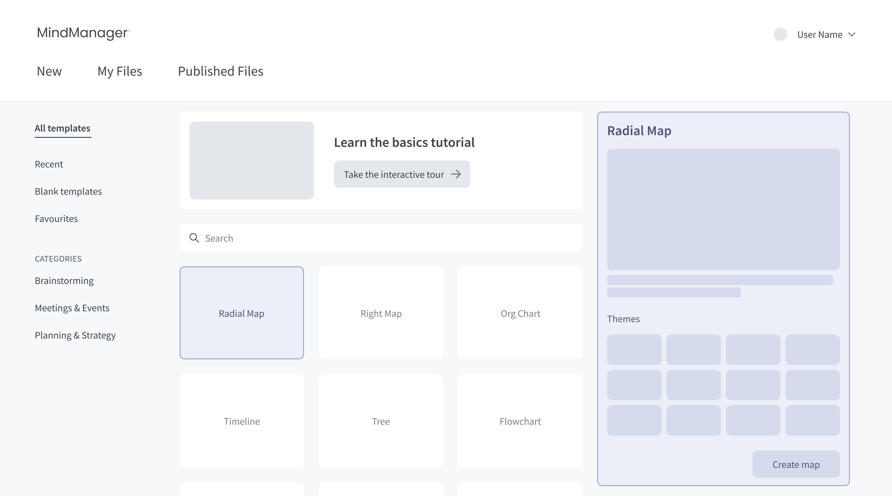
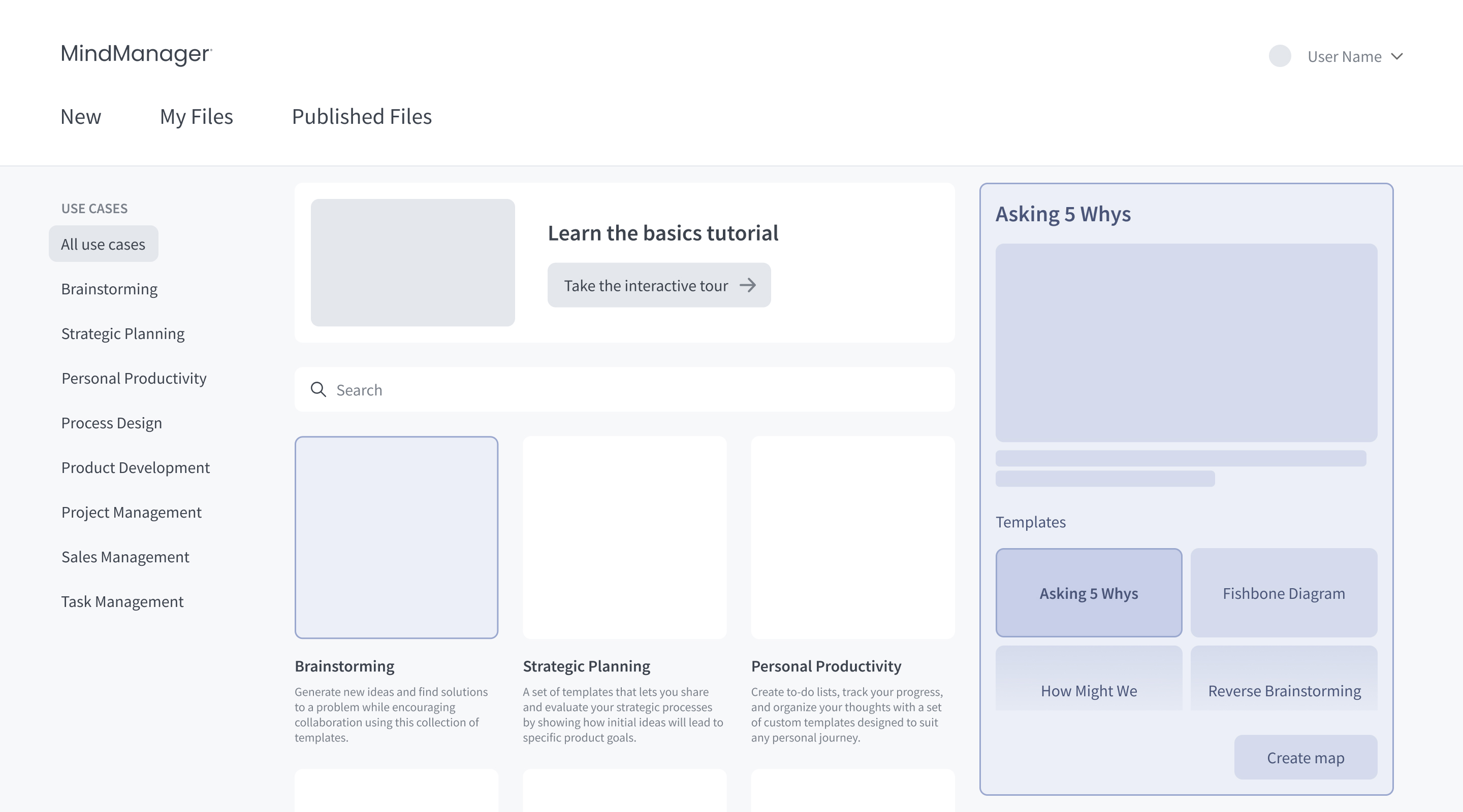
Early concepts explored an inline right panel: first as a preview with theme options, then restructured around use cases, with templates and previews surfaced in the panel. In the end, the panel was cut entirely, and the home page was scoped to use case browsing only.
Engineering constraints made the inline panel unfeasible within the release. Just as important, the panel was too small to communicate a template meaningfully, making it difficult to justify even without the constraint.
The home page became a focused, unobstructed browsing experience, and the case for a dedicated, high quality template preview grew stronger, directly shaping the Template Preview & Creation project.
Several initial categories were consolidated and renamed to be more distinct, and two new categories were added: Writing & Documentation for writing based workflows, and General for foundational blank templates.
Users struggled to identify which category matched their problem when labels were ambiguous, and experienced users needed a direct path to the blank templates they were used to.
The refined category set was sharper, easier to scan, and worked for a wider range of users out of the box.
The shipped experience, as it went live in four languages.

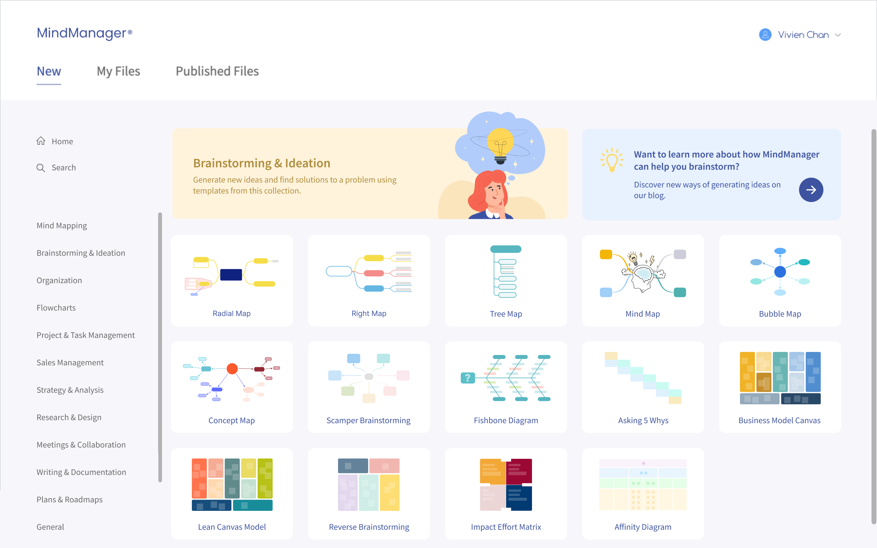
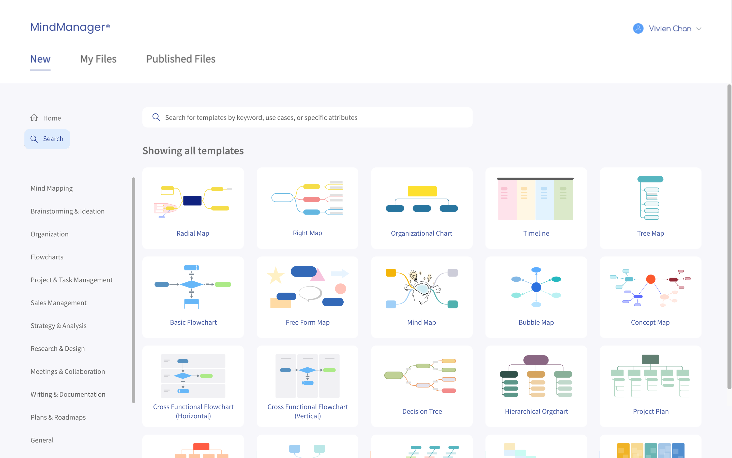
Following the Web launch, desktop users requested the same use-case-first approach for the Windows and Mac experience. Today, the desktop app has adopted both the use case categories and the templates created for them, extending the Web redesign into the product's flagship platform.
.png)
Introducing use-case categories helped both new and experienced users get more out of MindManager. New users could explore what the product was capable of from the start, while experienced users rediscovered workflows and templates they had not considered before, all without compromising the familiar starting points they relied on.
Without a solid foundation of understanding, any efficiency gains fall apart quickly. Most users arrived with a problem in mind but no clear sense of how MindManager could support it. Leading with use cases rather than blank templates gave users the context they needed to orient themselves first, making every subsequent step in the flow more intentional and confident.
This project was a reminder that good design shapes product direction, not just individual features. It influenced how templates and use cases were understood across the product and opened doors beyond the Web experience. What started as a Web redesign ended up shaping how the product was understood across platforms and teams.