
A mind mapping and visual productivity tool by Corel, used for brainstorming, planning, and organizing ideas into structured diagrams. MindManager Web is its browser-based app, bringing the desktop product's core mapping experience online.
MindManager Web's template library had grown, but there was no way for users to preview what a template actually offered before committing to it. Users had to create a file just to see whether a template fit their needs, with no way to glimpse its structure or content beforehand.
I designed a template preview and creation experience that let users explore a template's content and structure before starting a project. What began as a static preview evolved into a fully interactive, in-canvas experience that closely mirrored editing itself. Designed as the next stage of the use-case-first discovery work, it carried users from browsing into creation as one continuous flow, validated and shipped together as a single release.
The result turned templates into trusted, reusable assets, extending the value of this work well beyond the Web experience.
The preview was not built in a vacuum. The constraints below shaped the approach and the final solution.
Initial engineering estimates limited preview to a static, screenshot-based representation, requiring users to rely on a flat image rather than an explorable view of the template.
Changes had to integrate into the existing Web editor and canvas, with minimal added engineering complexity.
This work began as the use-case-first discovery model was in design. The two experiences were validated and shipped together as a single release, requiring close coordination throughout.
Selecting a template in MindManager Web took users directly into the canvas editor. Clicking a template meant immediately creating a file, but users had no way of knowing that in advance, and no sense of what they'd find on the other side until they were already committed.
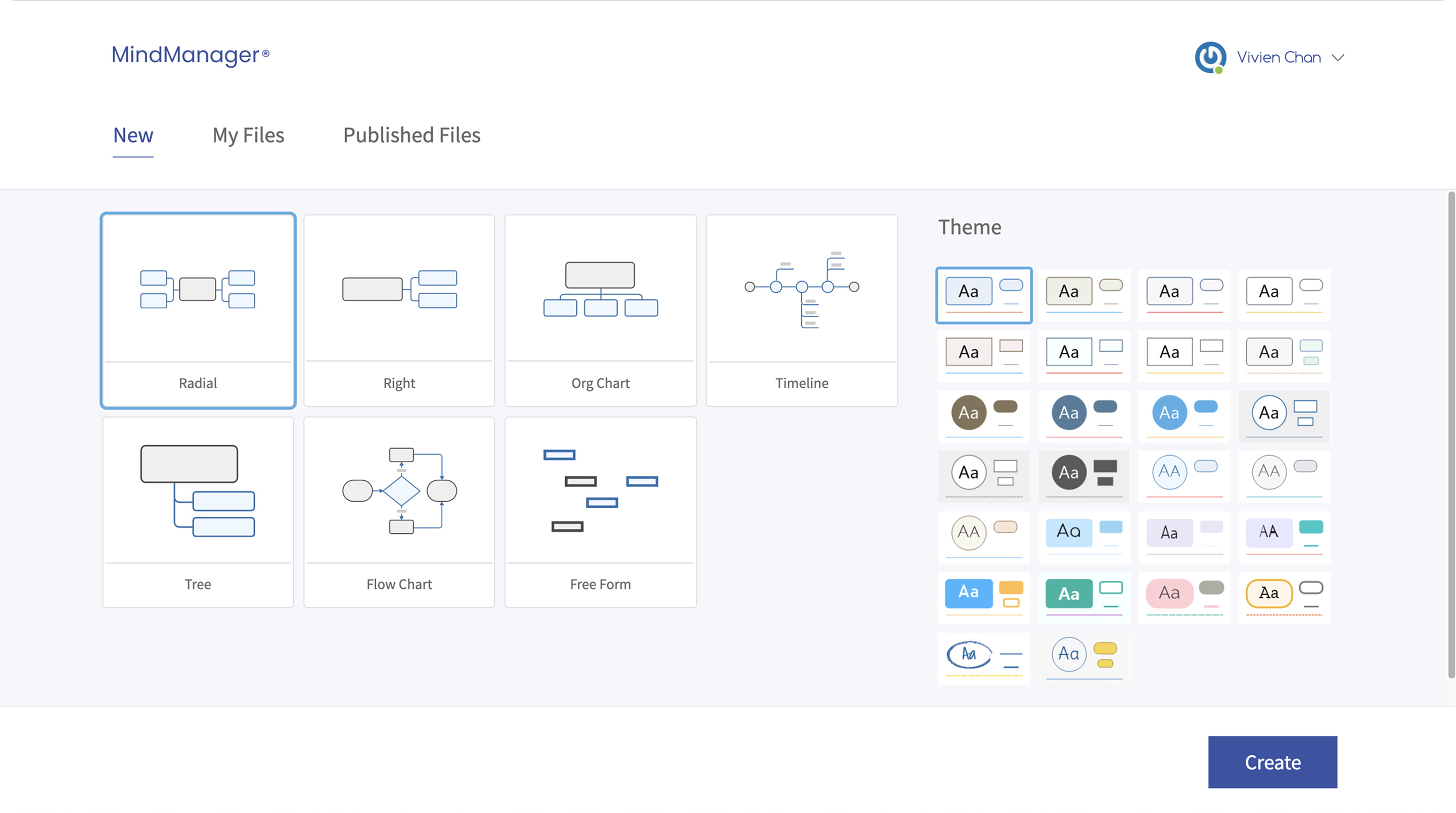

Competitive analysis showed Miro, FigJam, and Lucidchart all offered some form of preview before commitment. MindManager offered no equivalent. The risk: users uncertain about what a template would create would not commit to one at all, undermining the discovery experience the use-case-first redesign was built to drive them toward.
The goal was one coherent path from home page to canvas, where users always knew where to start. As the next stage of the use-case-first discovery work, the strategy centered on giving users the context to choose with confidence, through two principles:
Letting users explore a template's purpose and structure without entering an editable state turns preview into a low-risk moment of exploration, rather than the first step of creation.
Give users a template's purpose, structure, and example content before asking them to commit, then let them start from that example or a blank version, without splitting into separate modes.
Competitive analysis had already shown that comparable tools paired template descriptions with some form of visual preview. Usability testing confirmed this was the right direction: users who could see a template's structure and content before committing felt more confident in their choice than those working from a description alone.
Once a working preview existed, testing revealed a new problem: some users mistook the read-only canvas for an editable one, attempting to interact with it directly and overlooking the action needed to actually create a file. This meant the preview needed clearer signals to distinguish viewing from editing, without undermining the goal of letting users explore freely.
Offering both pre-filled and blank starting points was the right call, but the toggle between them was easy to miss, and users who started from pre-filled content wanted an easy way to clear it. The problem was not the choice itself, but how clearly it was presented.
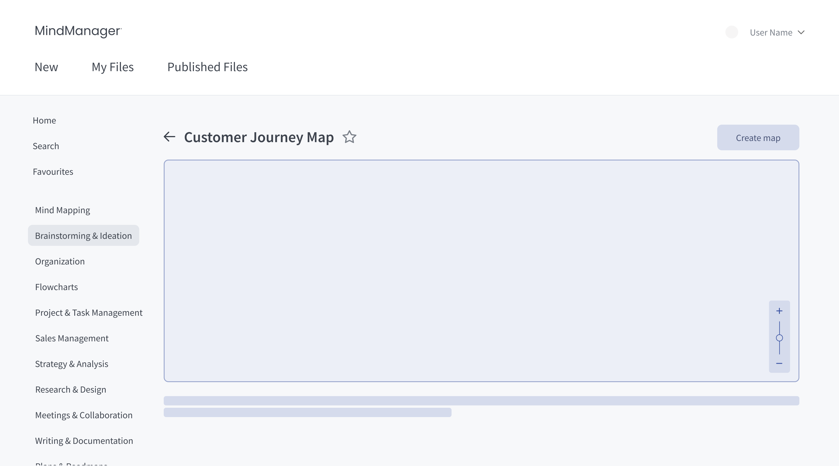
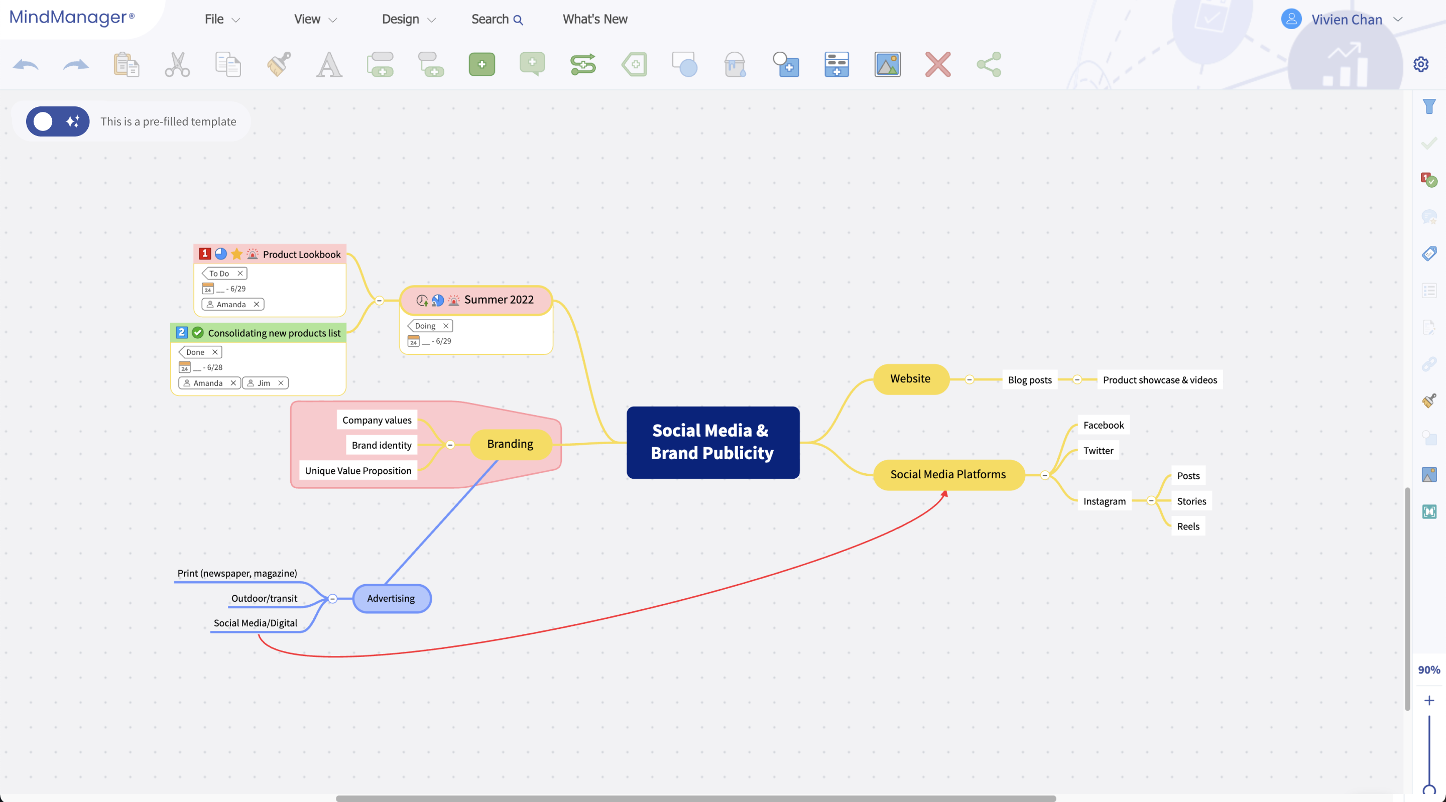
Initial engineering estimates limited preview to a static, screenshot-based image. A later review with engineering confirmed a live, in-canvas preview was feasible, letting users zoom and pan through the actual template rather than a flat image. This also removed the need for a separate preview page, taking users from browsing directly into an explorable, read-only version of the template.
Engineering feasibility shifted between the initial estimate and the later review, opening up a richer interaction than originally scoped. Removing the separate preview page also simplified the broader journey.
Users gained a fully explorable preview instead of a static image, and stayed just one click from returning to browsing if a template was not the right fit.
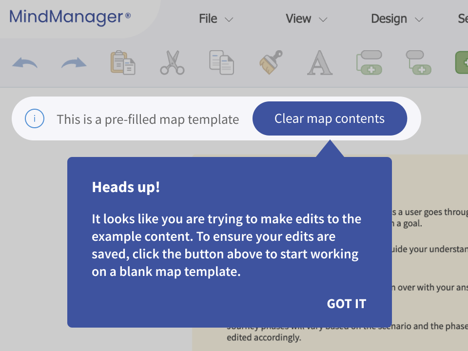
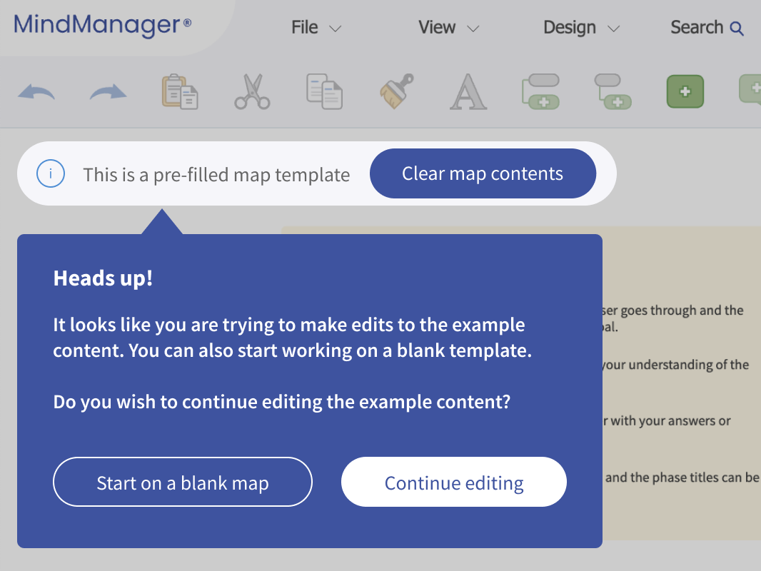
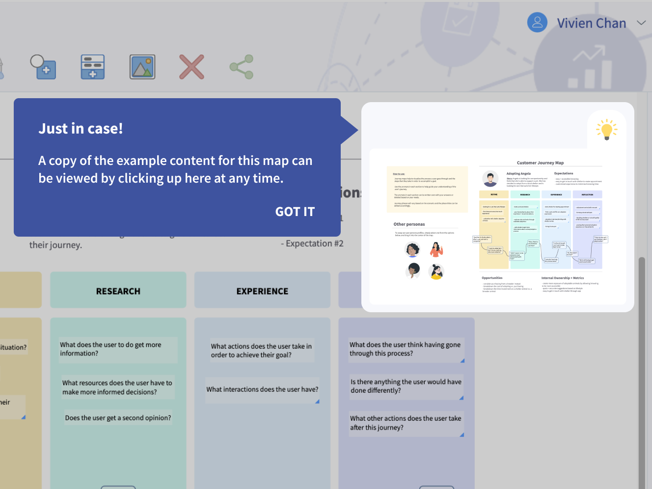
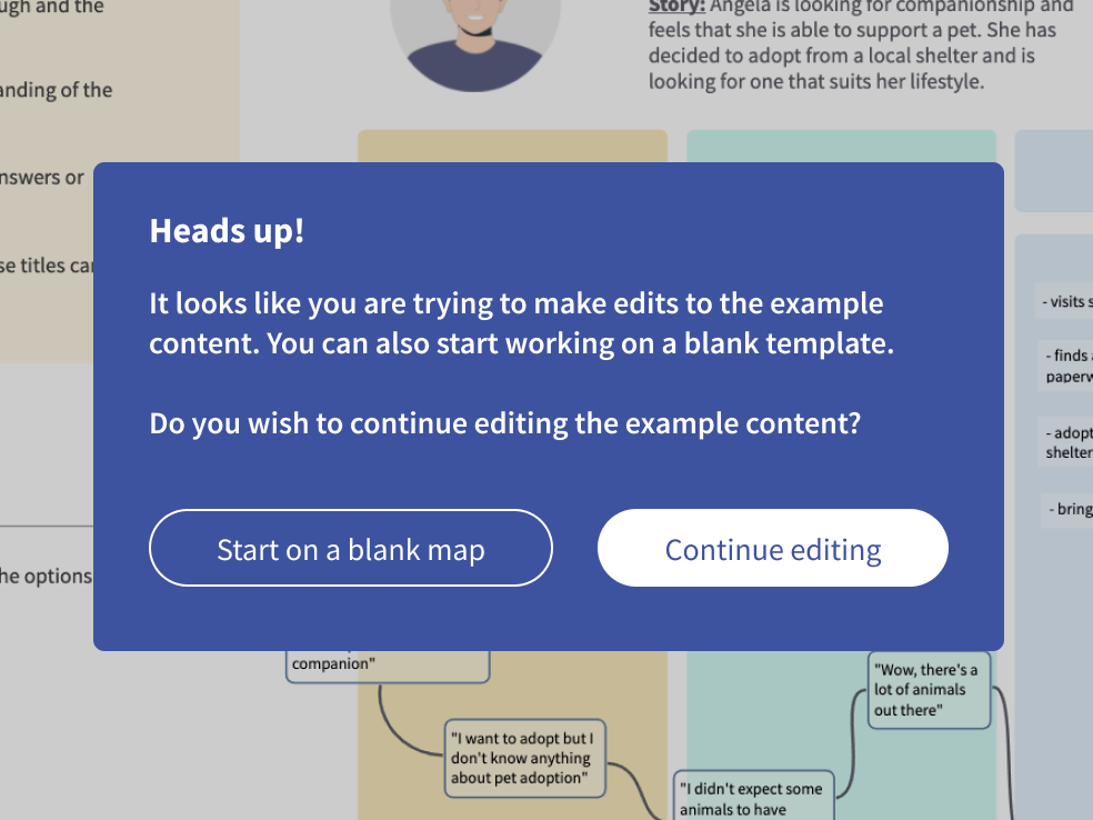
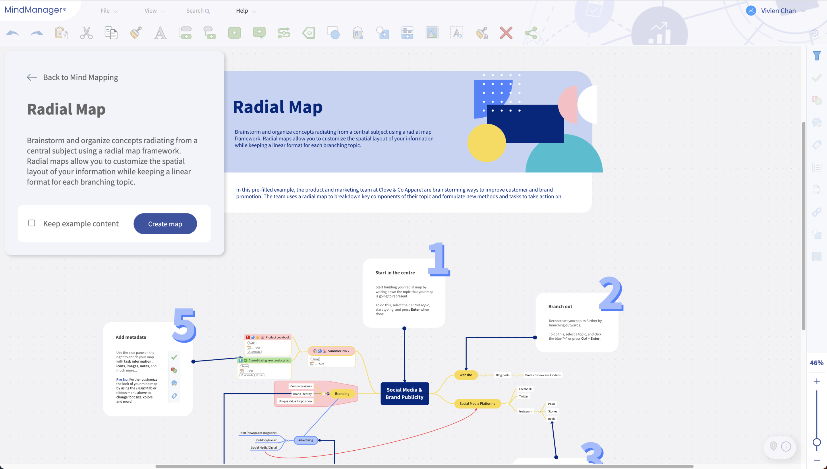
Early designs surfaced the choice through an in-canvas toast, triggered when a user tried to edit the example content. After several iterations, the shipped version made pre-filled content the default, with a checkbox inside a large dialog to keep or discard template contents before creating the file.
With the user's focus on the canvas, the toast was easy to miss and confusing. Making pre-filled content the default let newer users learn from a real example, while the checkbox gave experienced users a clear way to start blank.
The choice became clear and hard to miss, without splitting the experience into separate modes. For me, it was a lesson in keeping the logic as simple as possible.
Every decision converged into one preview-and-creation experience, explorable, informative, and continuous with browsing. It shipped as part of the redesigned MindManager Web, live in four languages.
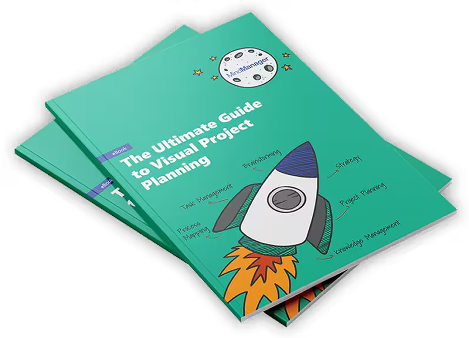
The template preview and creation experience helped position templates as polished, trustworthy starting points rather than rough examples. That credibility was strong enough to anchor an eBook built in collaboration with Product Marketing, extending the value of this work well beyond the Web.
Beta testing across the full discovery-to-creation journey, from use-case browsing through template preview and creation, reflected strong perceived usability, scoring 4.23 out of 5. The result reflected not just the preview and creation experience but the cumulative effect of the broader Web redesign.
A template sitting in a library does nothing on its own. This project reinforced that the responsibility was on the product to demonstrate value upfront, through preview, description, and example content, rather than expecting users to figure it out after they had already committed.
Supporting both pre-filled and blank starting points meant designing for two very different relationships with the product at once. Where Use-Case-First helped users rediscover what MindManager could do, this project let users at any level learn how to use a given template, through exploration rather than instruction.
Building preview as a read-only, explorable state rather than a gated decision point was one of the more counterintuitive calls in this project, but it paid off. Room to look around before deciding built more confidence than forcing an early choice ever could have.